Carry+
Carry+ is a platform for Iranians abroad to send packages, documents, and pets with travelers who have extra luggage space. Travelers earn money delivering items while senders get fast, secure, and affordable service.
UX/UI Designer
3 Month- Part Time
Group of 2 Designers
Figma, Maze, ChatGPT
Business Need
Design an application with a reliable process that enables senders to quickly and easily find travelers for shipping their packages.
Goals
Stablish a trustworthy and reliable platform where senders can confidently connect with travelers and ensure secure deliveries.
Facilitate simple and intuitive connections to enable seamless interactions between senders and travelers.
Streamline coordination by simplifying communication and ensuring clear agreements on delivery details.

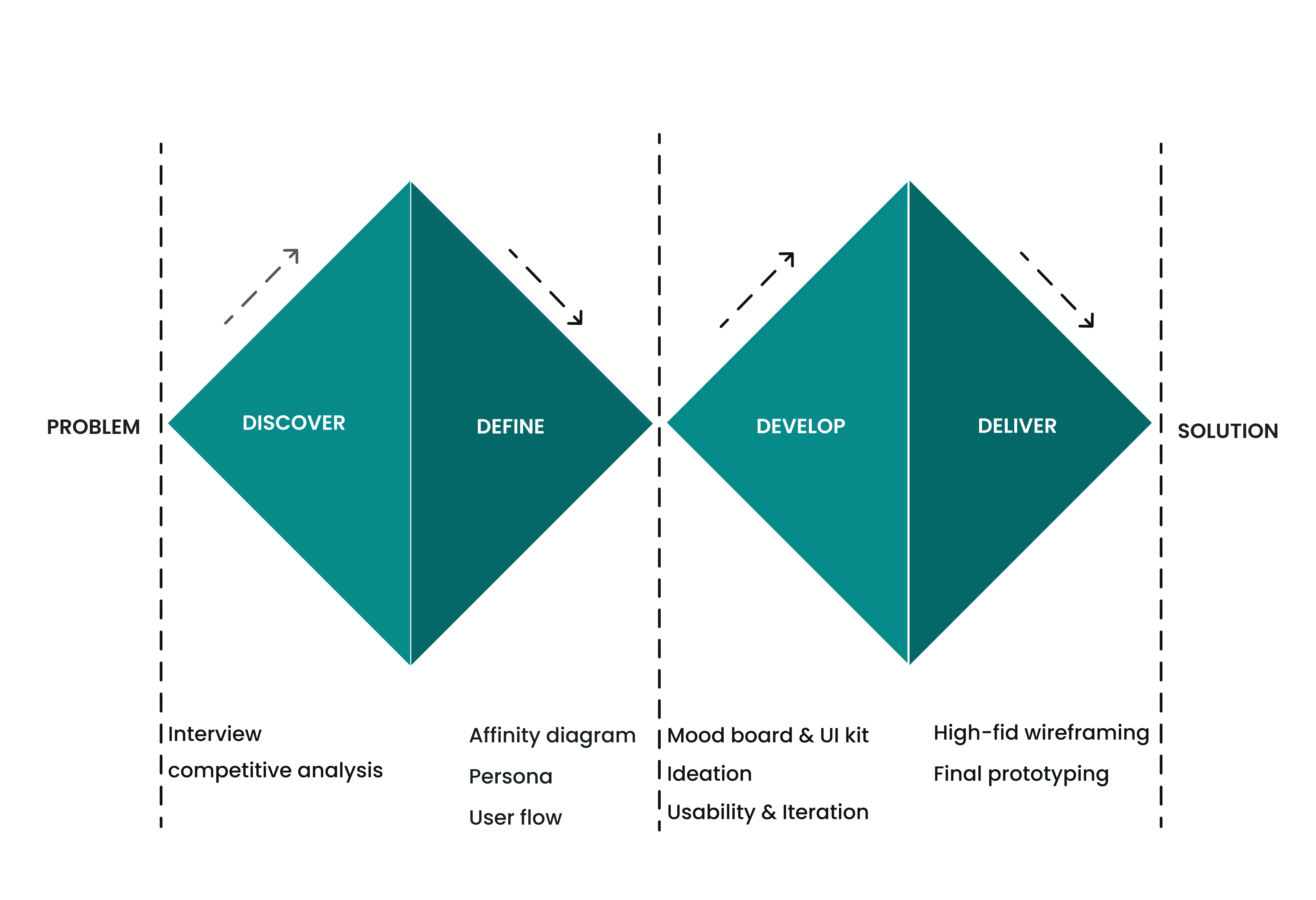
We followed the double Diamond method based on the Design Thinking Methodology. It was not a linear path, we bounced between stages as the project progressed.

We conducted our research in two phases Phase
1: User Interview Phase
2: Competitive Analysis
User Interview
We interviewed 17 users using a mix of open and closed questions to learn about their values, goals, and experiences. Then, we organized the insights into an affinity diagram to spot common needs and pain points, helping us shape clear personas and design with purpose.
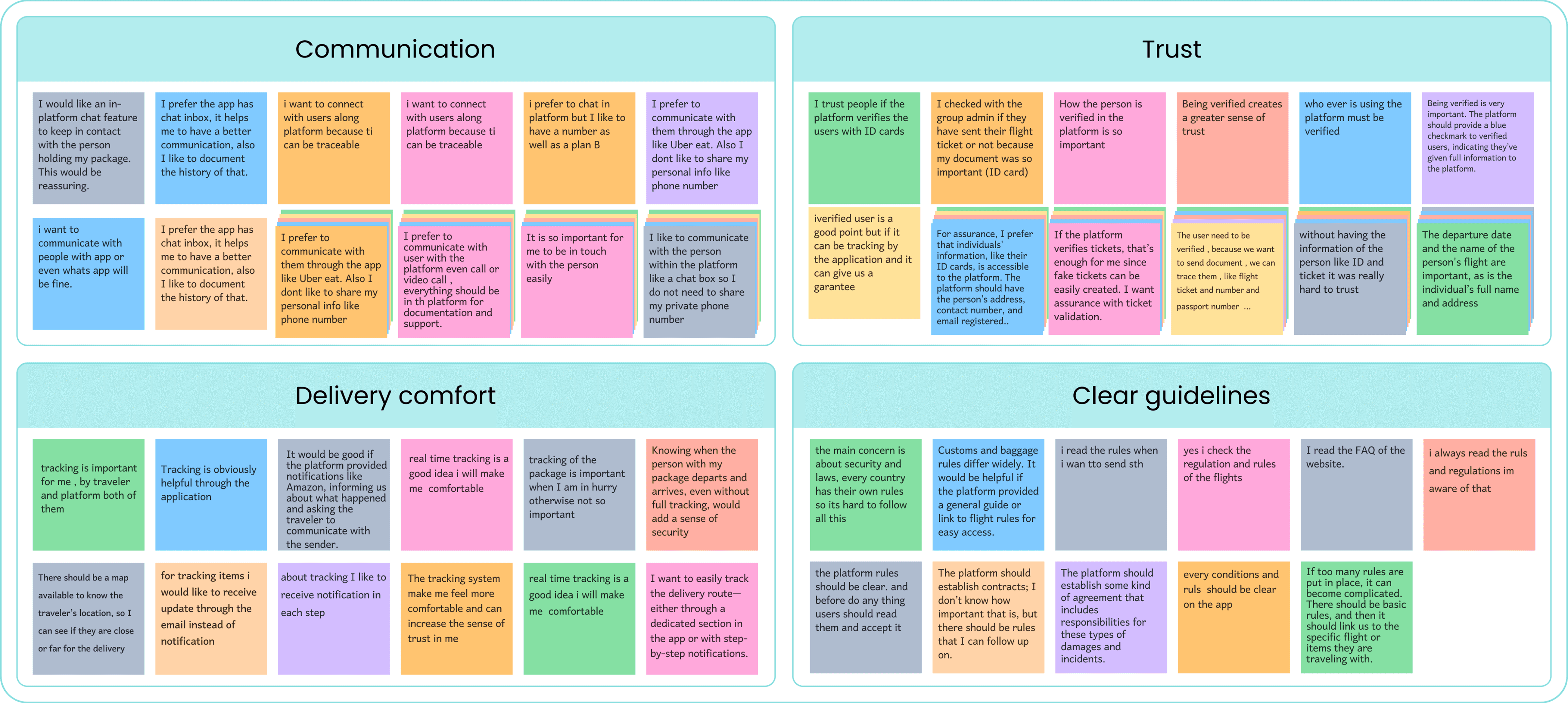
Key Takeaways
Effective communication and transparency in user interactions.
Clarity in terms, conditions, and responsibilities for all parties involved.
Concerns about the credibility and accuracy of user information, and ensuring security throughout various processes.
Concerns about delays and the need for clear updates and confidence in a timely, secure delivery.
Competitive Analysis
We analyzed Chamedoon, Chaparland, and relevant Telegram channels for their service similarity and informal alternatives.
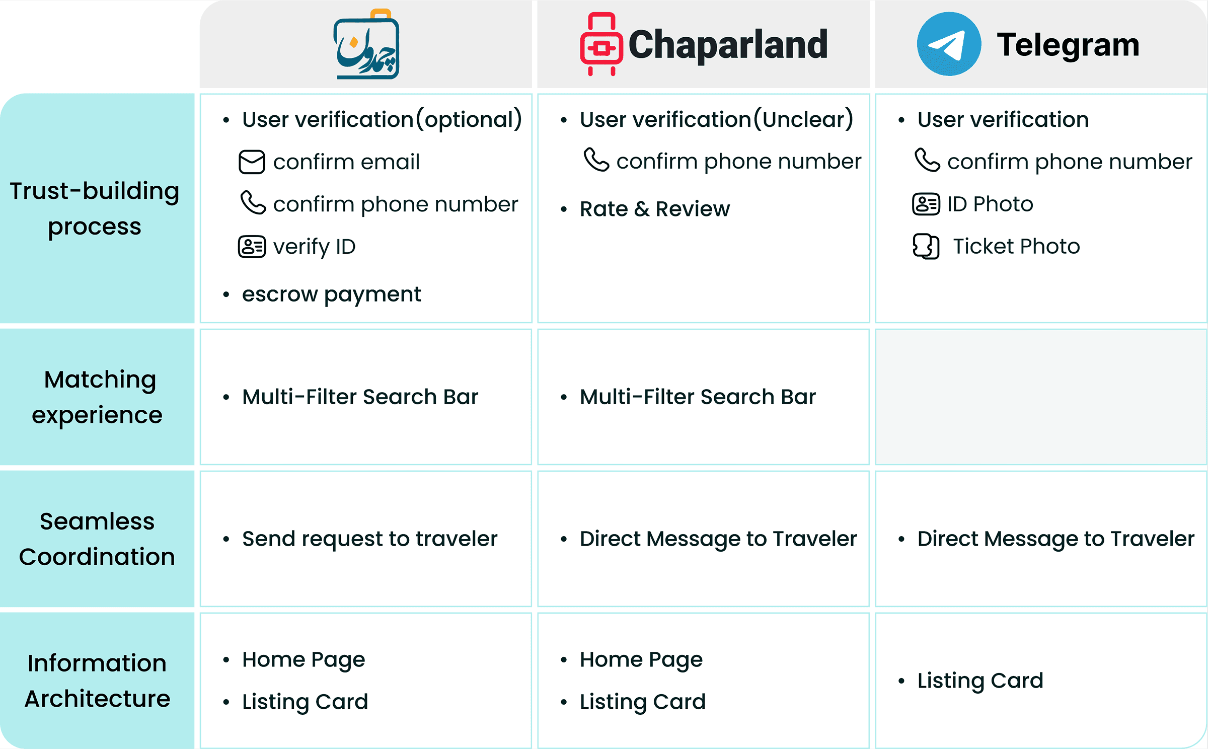
Key Takeaways
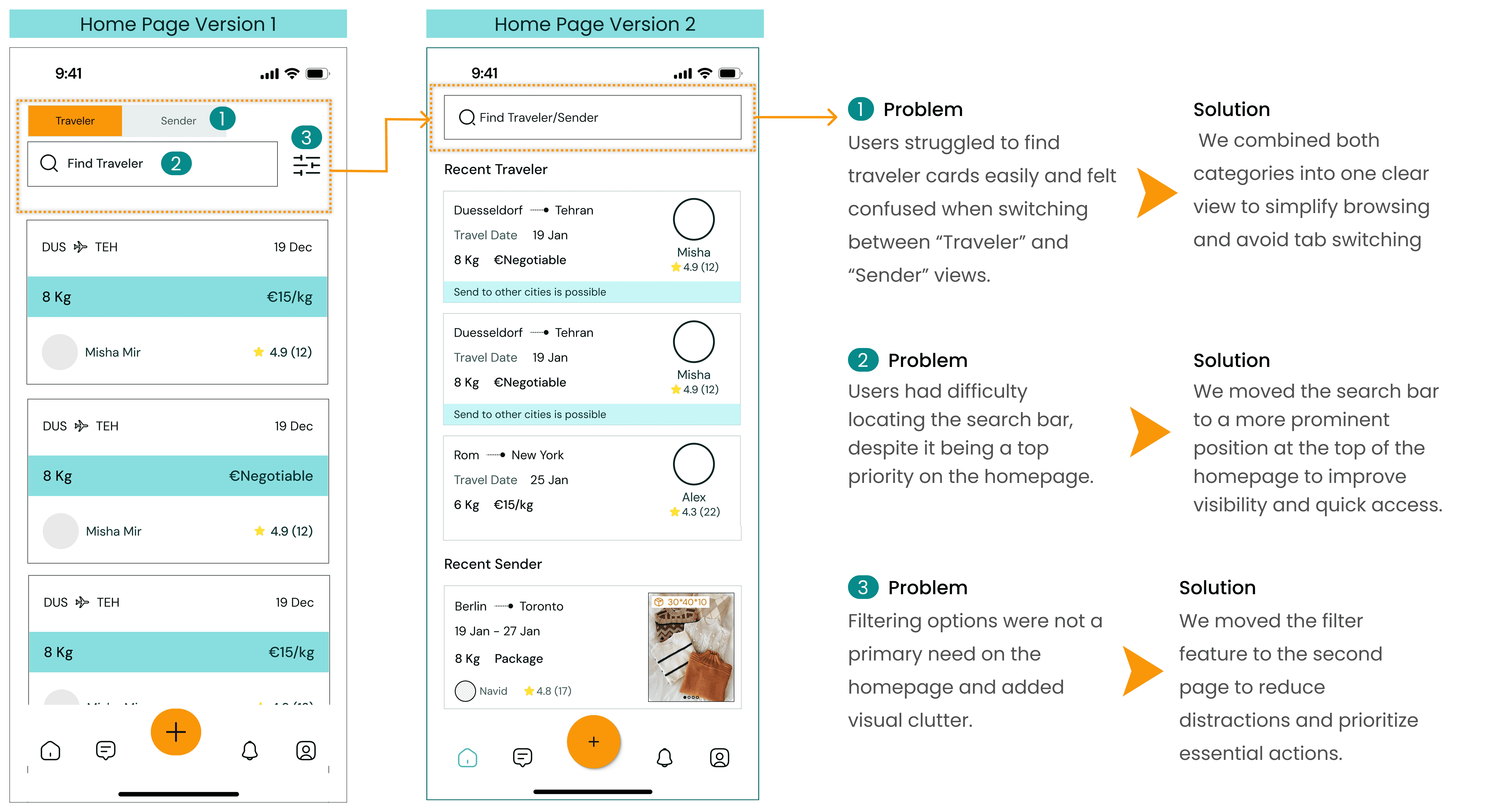
Analyzed homepage layouts to define information architecture for our own homepage.
Studied listing card structures to design easily scannable and informative cards.
Verified flight tickets in traveler posts inspired us to add trust-building steps to our posting flow.
We also reviewed Airbnb and BlaBlaCar for their focus on trust and smooth communication, aligning with our design goals and user pain points.
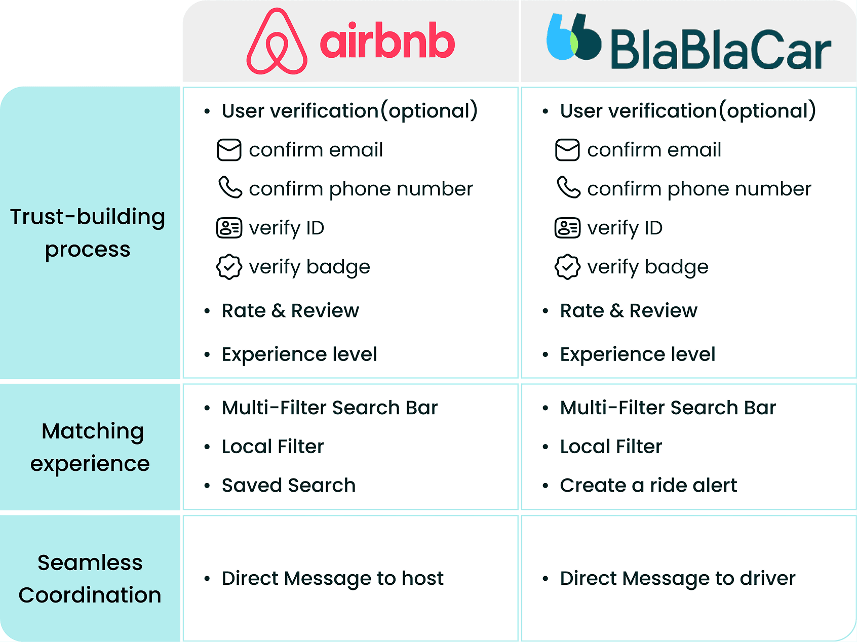
Key Takeaways
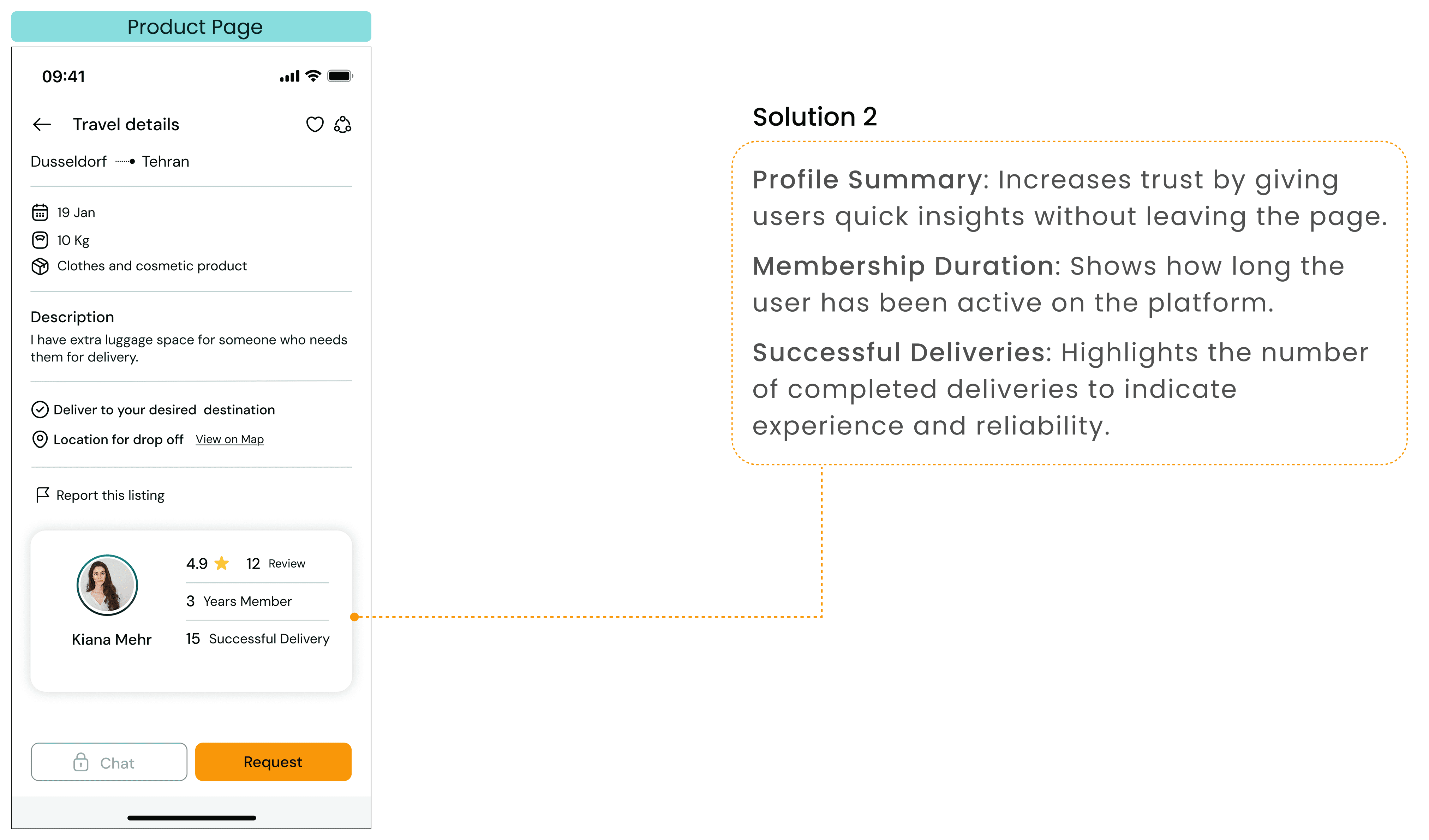
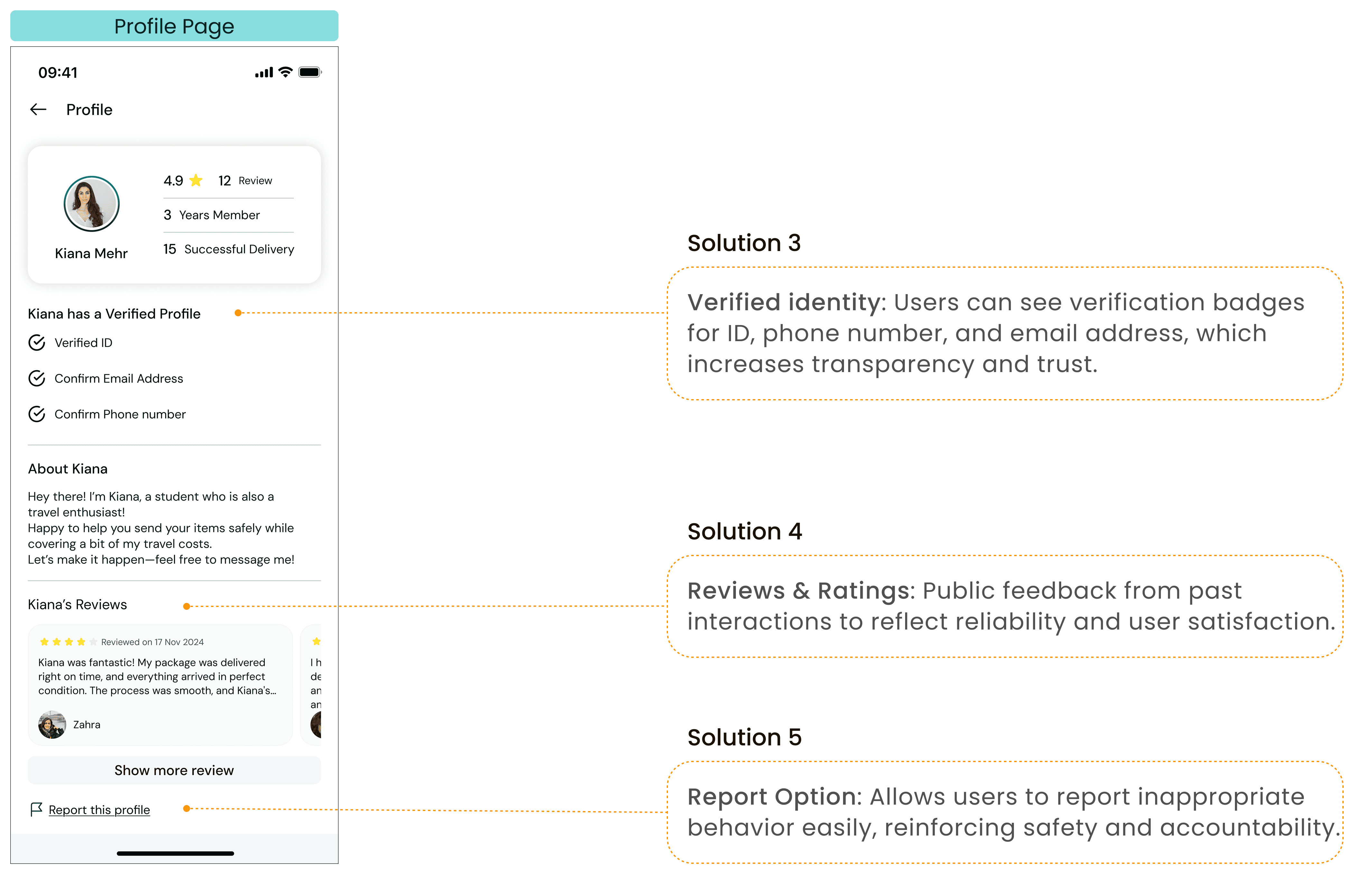
Show user experience level, ratings, and reviews to build trust
Use verified badges for trusted providers
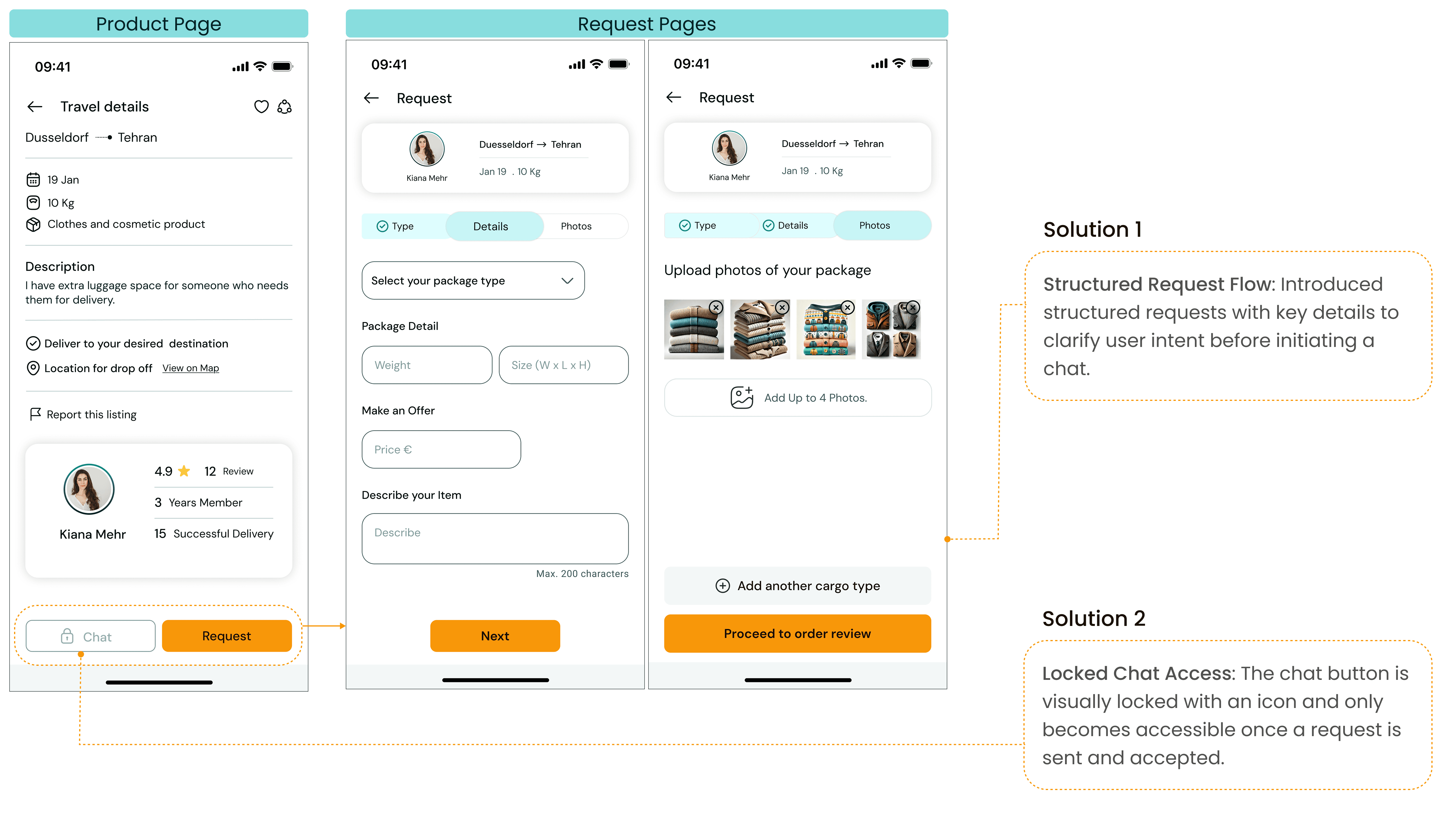
Include multi-filter search and saved searches for better usability

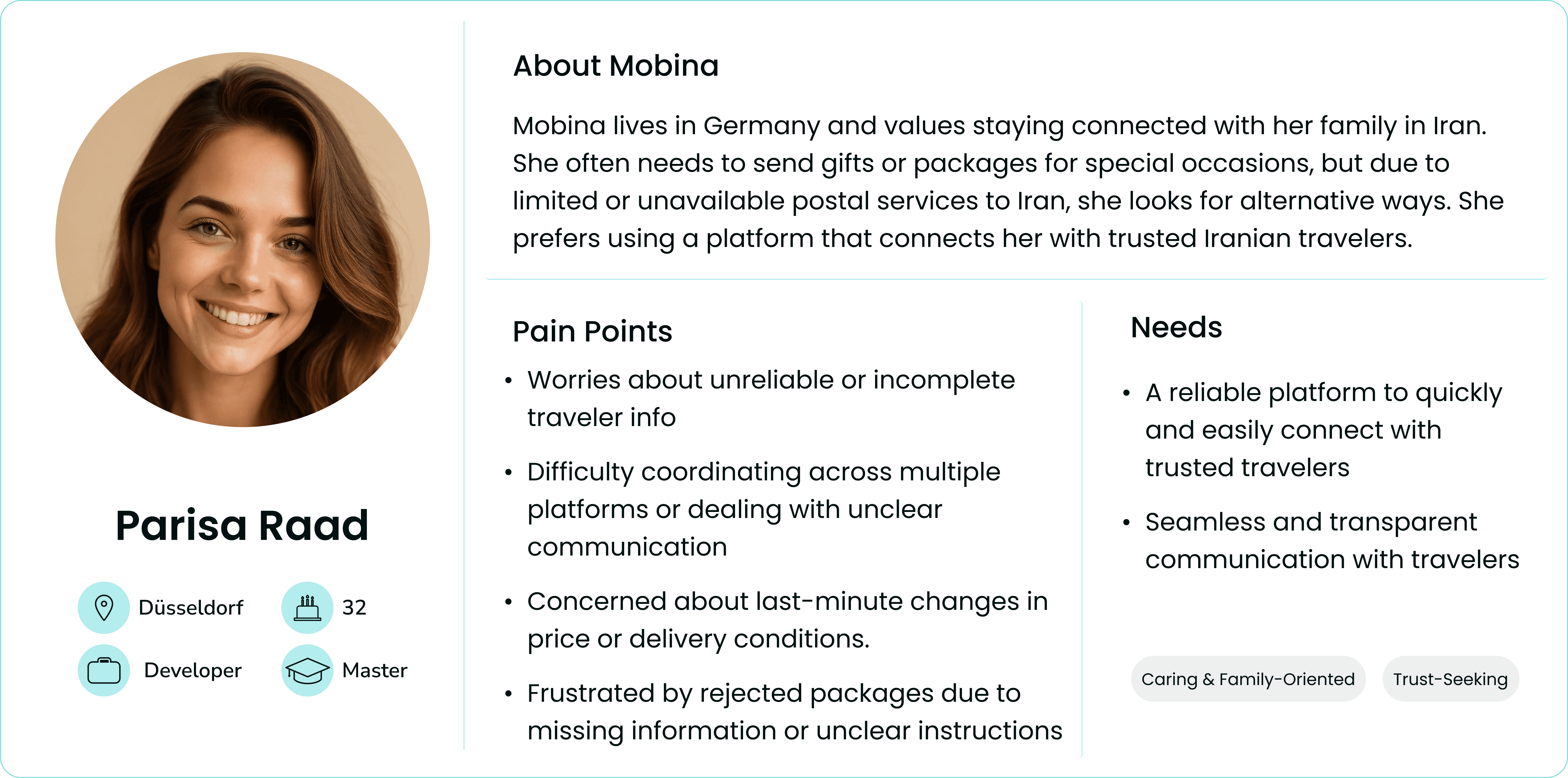
Persona
The insights we gained from research leading up to the persona. The main goal is to display those patterns and pain points, which allowed us to further empathize with users.


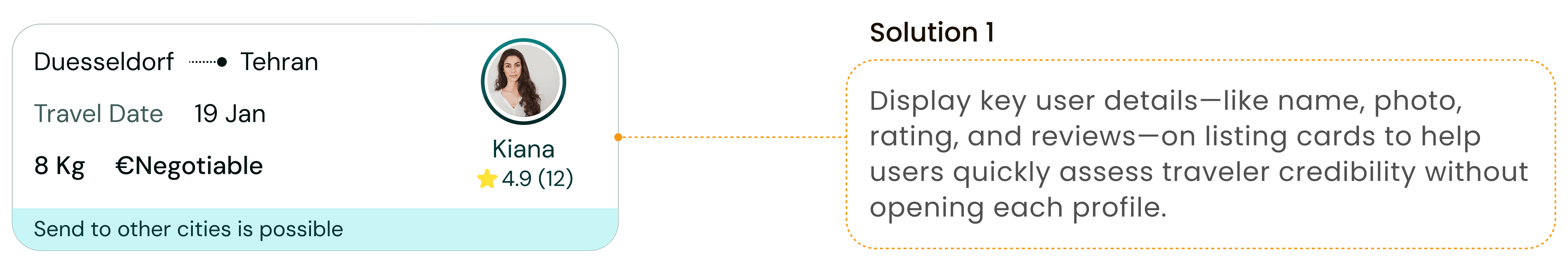
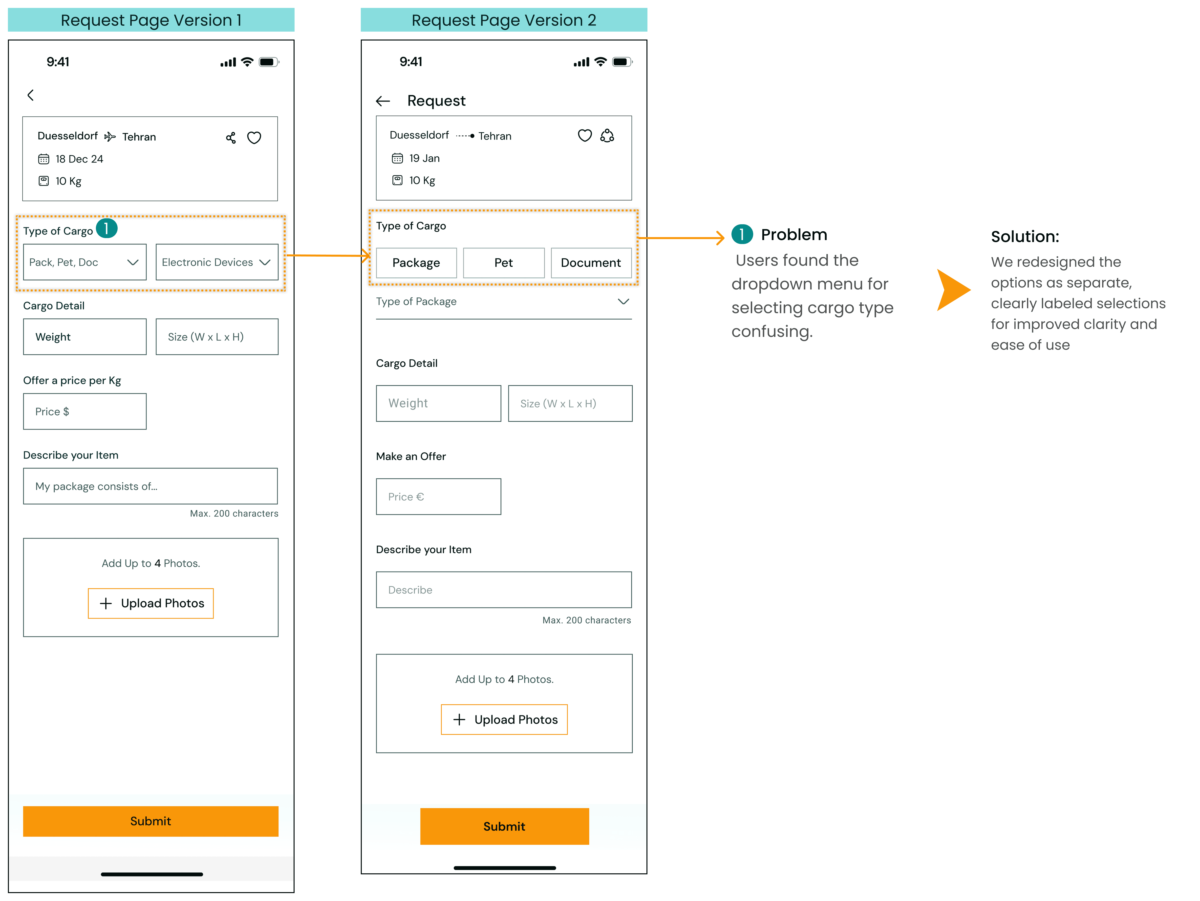
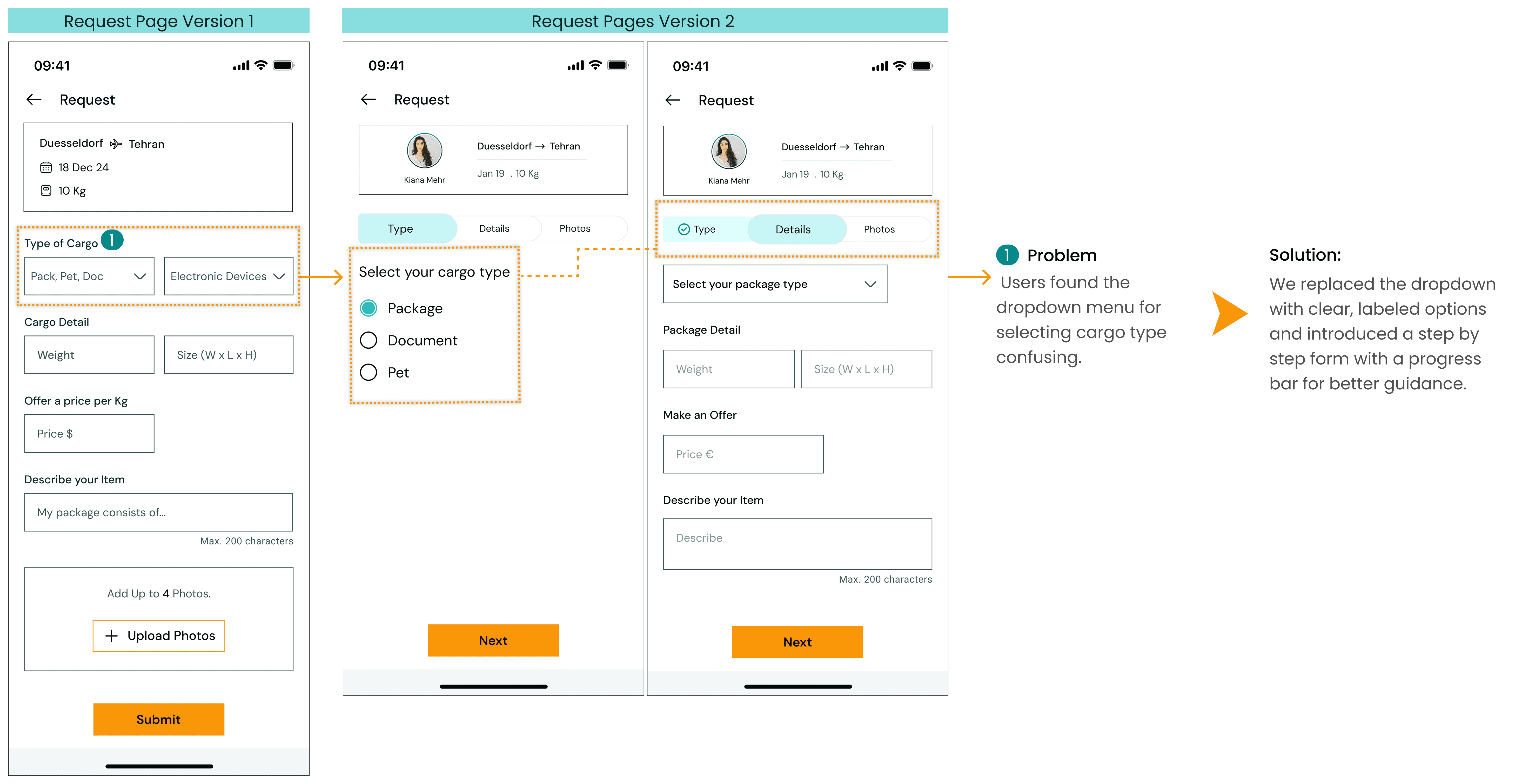

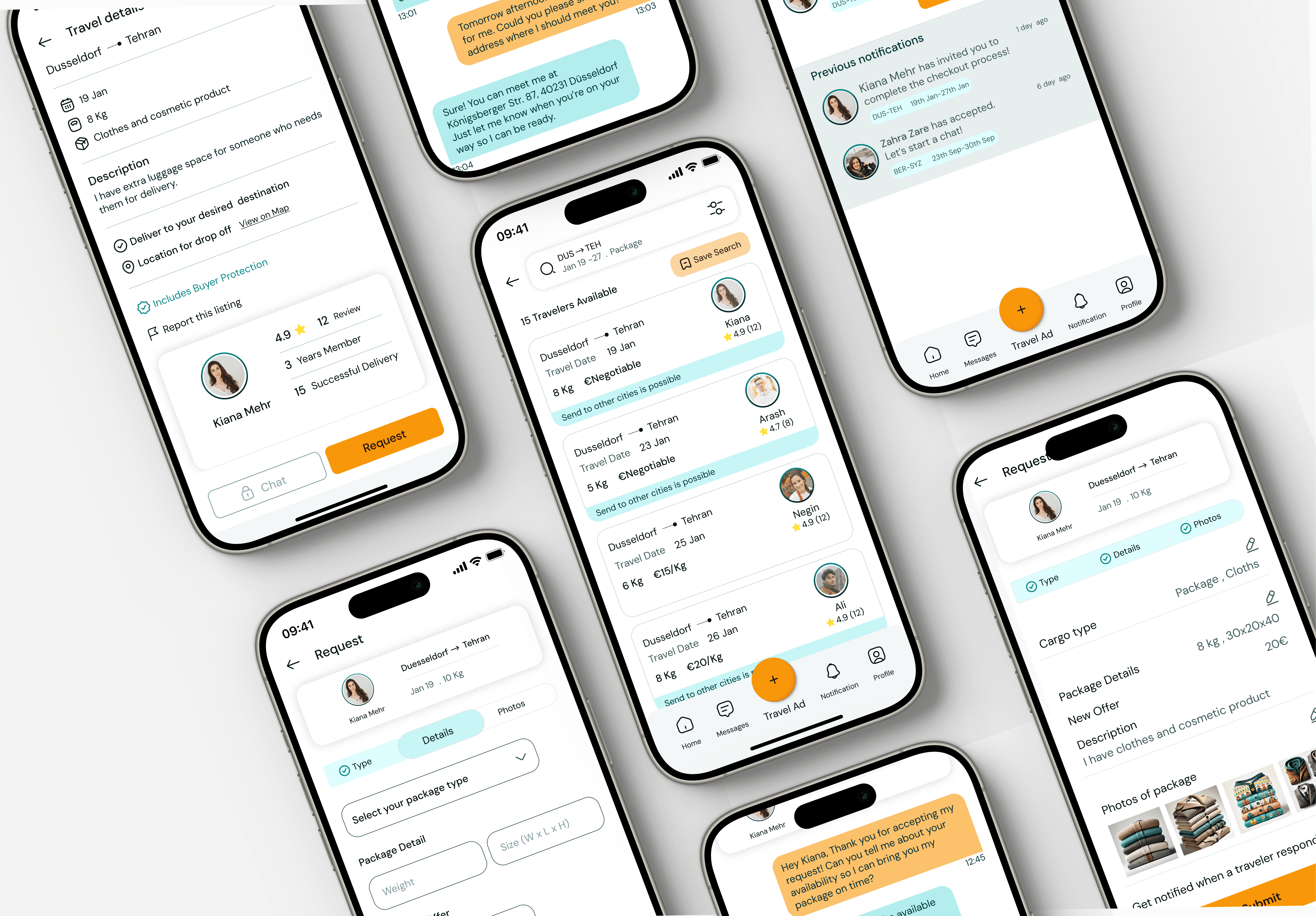
High-fidelity wireframes


What did I Learn?
• Making a good balance of users' needs and the stakeholder's marketing strategy in mind while designing
• Effective communication with team members and leading challenging situations
